PROJECT ANTI LOVE
POSTER DESIGN
THE CLIENT & PROJECT
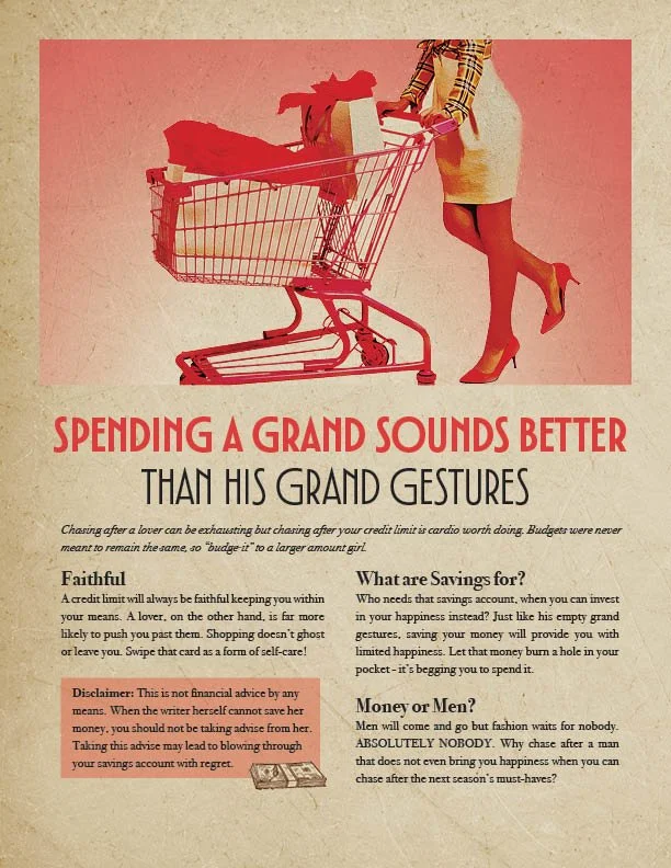
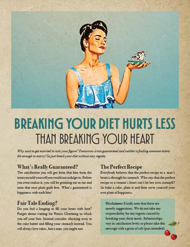
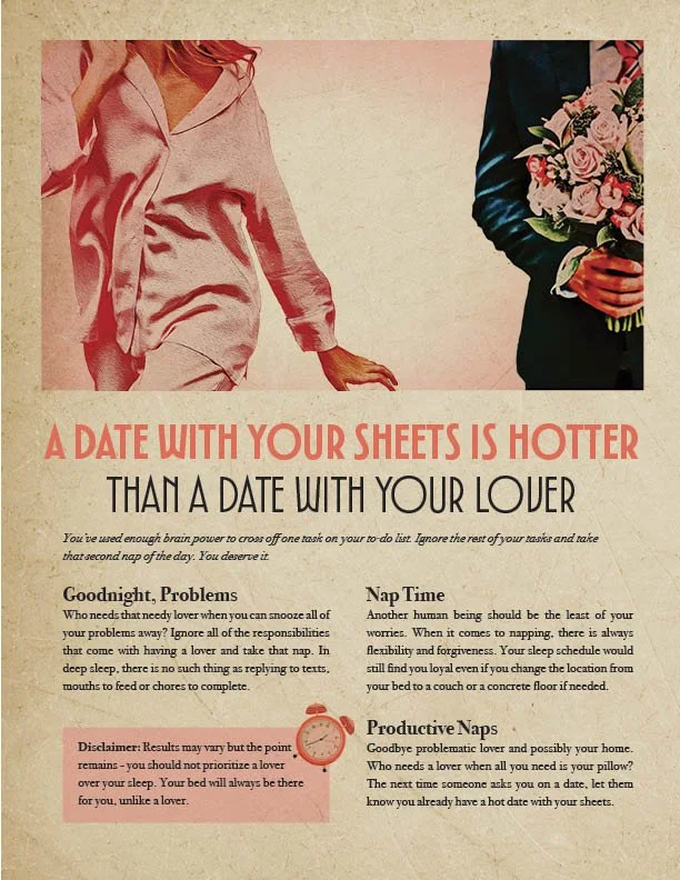
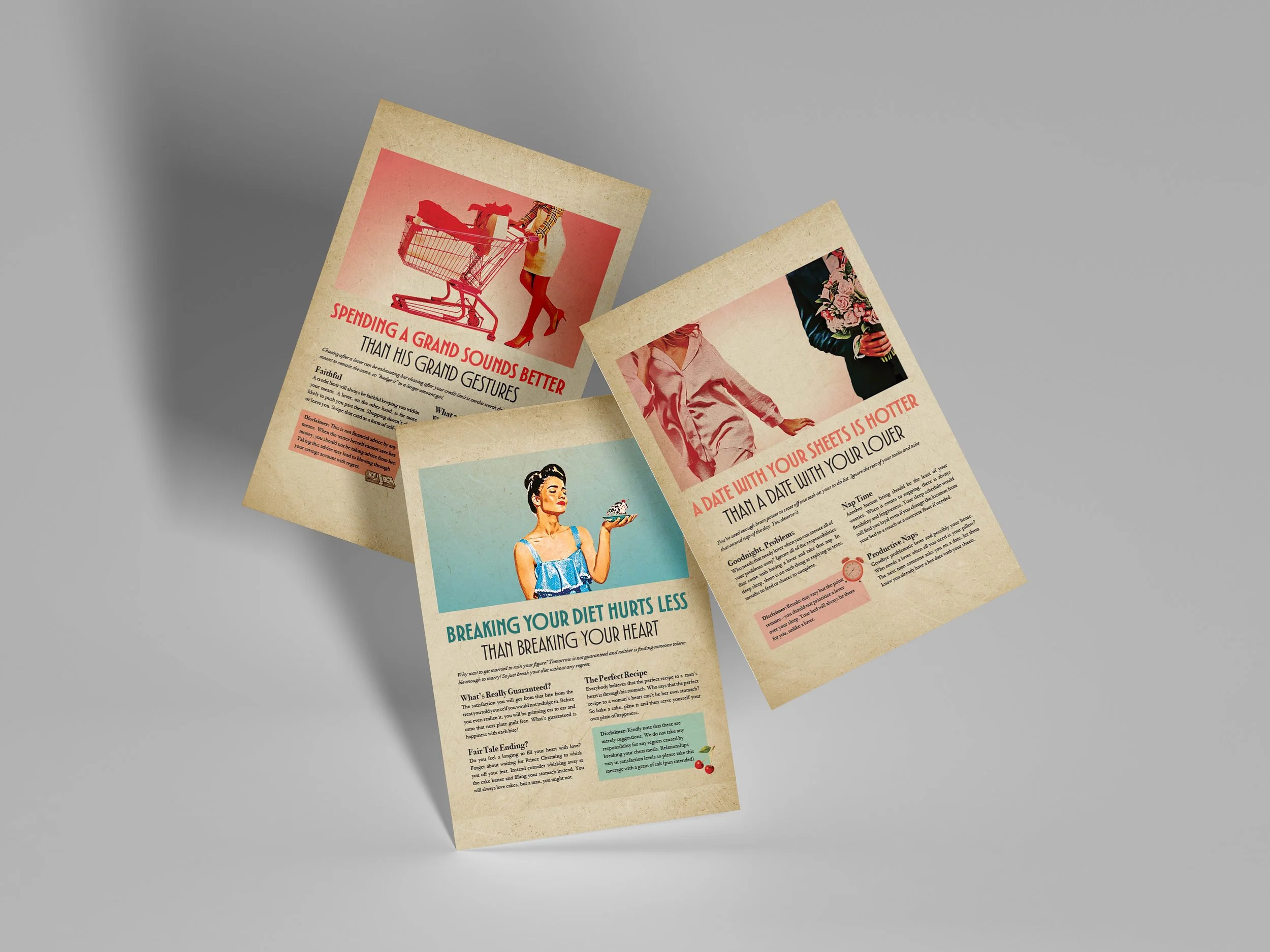
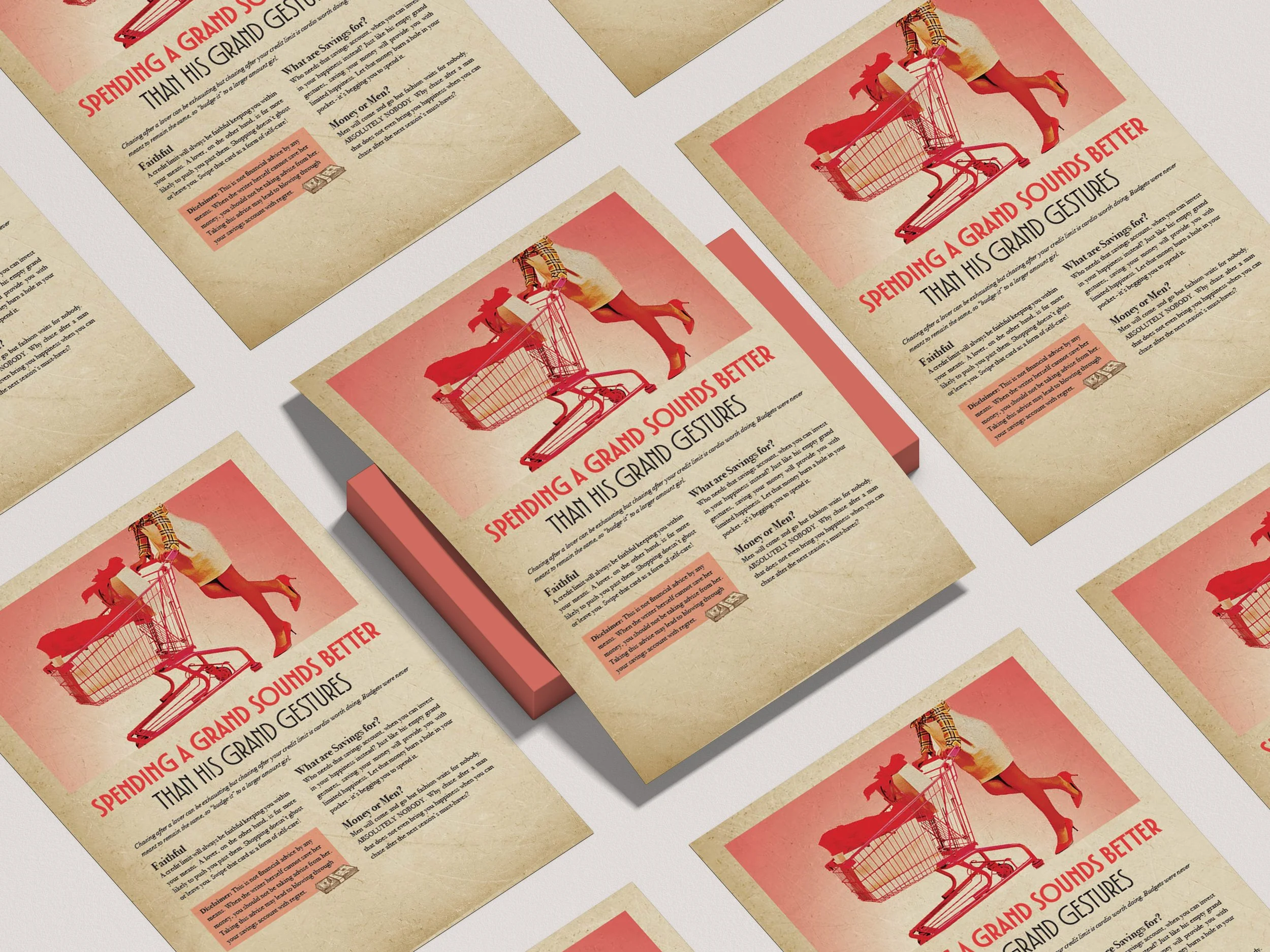
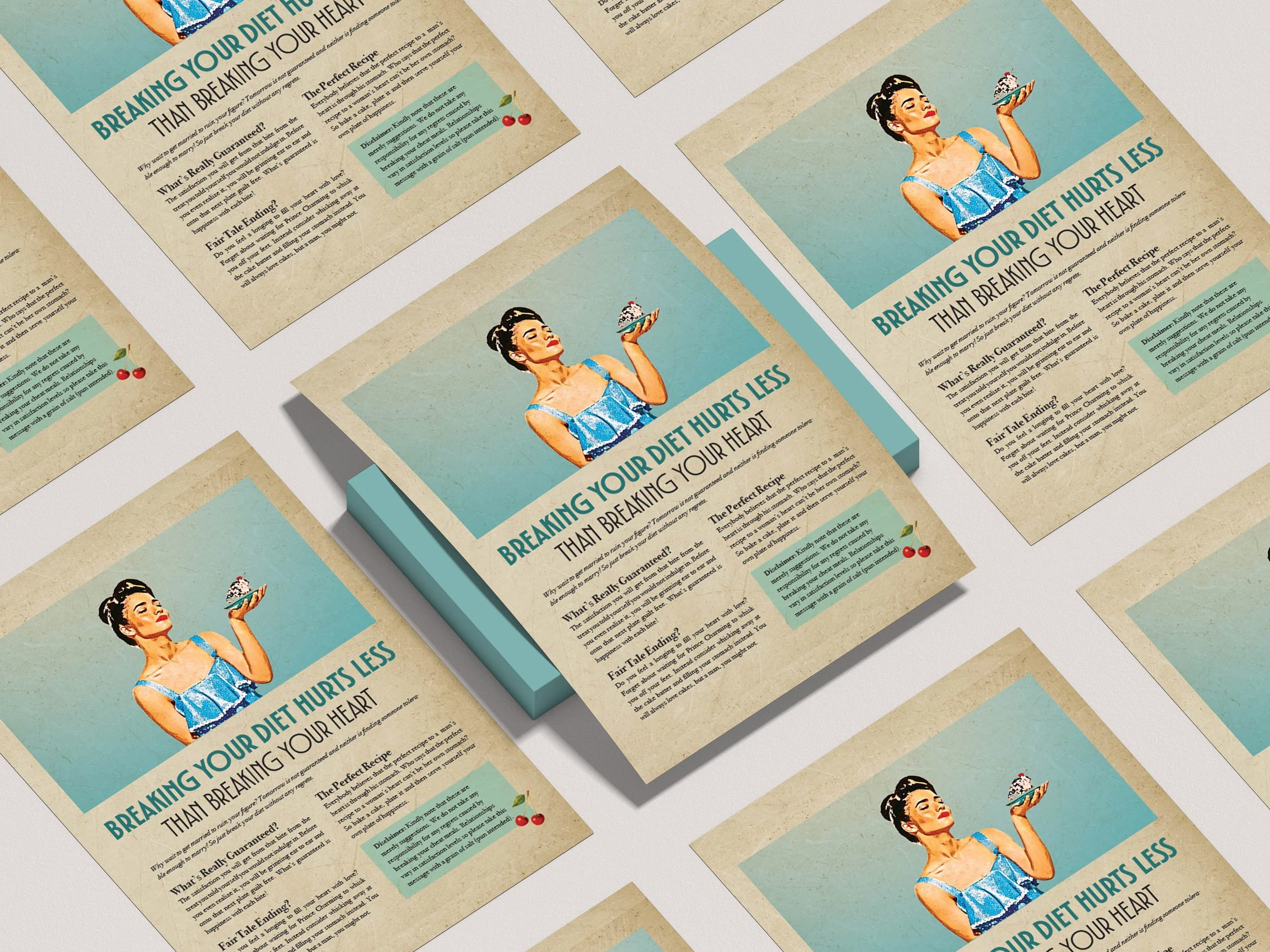
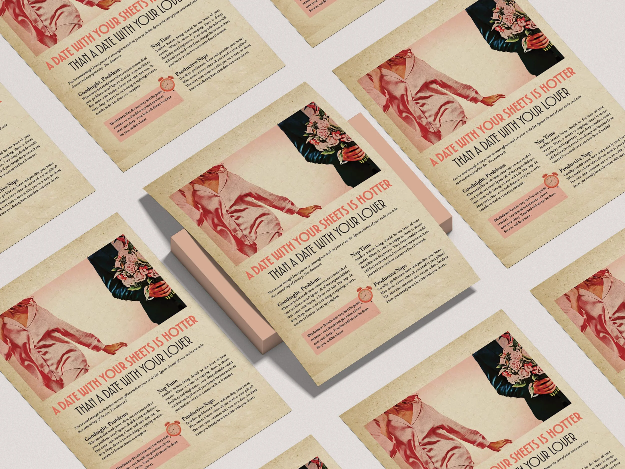
Project Antilove is a three poster series focused on convincing an audience to remain single instead of getting into a relationship that will ruin their lives. Each poster focuses on a different theme encouraging the reader that the unhealthy habits they were told not to indulge on are actually better for them than finding a significant other.
THE TOOLS


InDesign
Photoshop
THE PURPOSE
A three poster series was created with the purpose of using different photographs to create one cohesive poster series. Images were to be transformed from a modern style to a retro pin up style for these posters.
THE STRATEGY
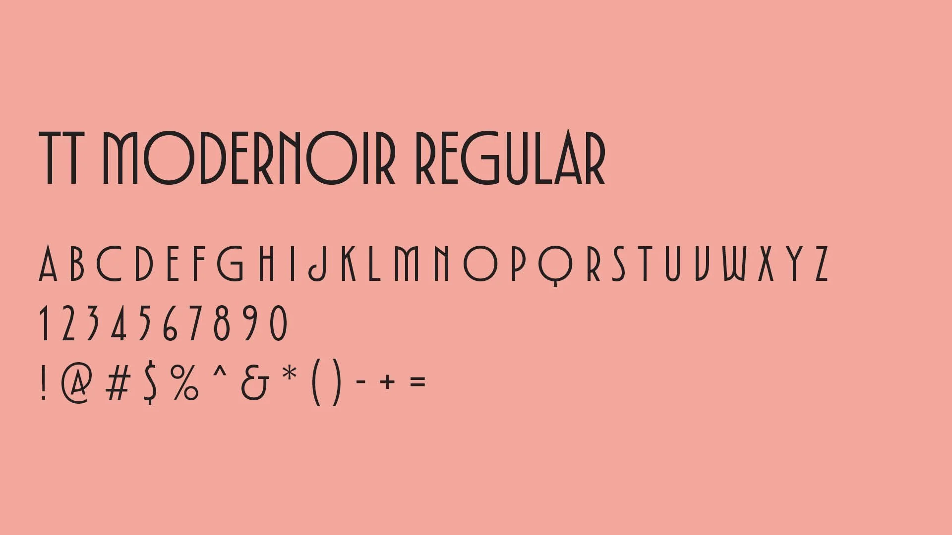
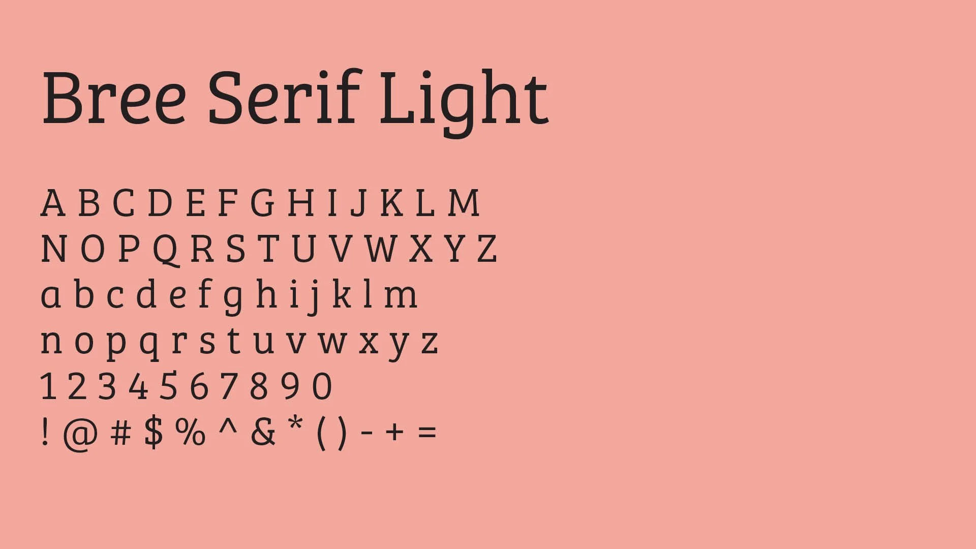
In order to make the posters lighthearted, inspiration was taken by the sarcastic nature from retro ads. The typography and imagery chosen reflected the pin up ads from the 80’s.




The images edited into a pin-up style.
THE PROCESS
By making a moodboard with inspiration from retro ads, I was able to draw inspiration from the typography and imagery.
From there, brainstorming occurred of the different topics of the poster series to which I concluded with the following:
Spend a Grand (Not Grand Gestures)
Break Your Diet (Not your Heart)
Dreamy Dates With A Bed (Not a lover)
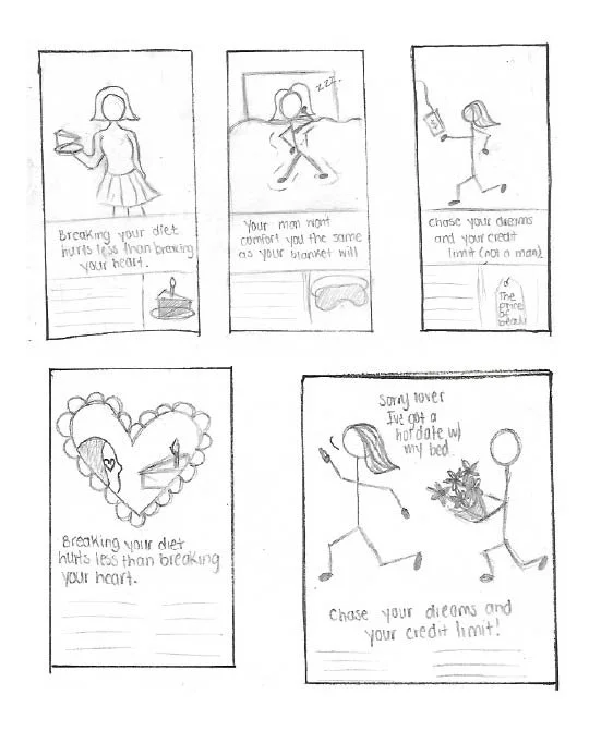
Sketches were done of possible poster layouts, which were used to find suitable photographs for each poster.
The photographs were then manipulated within Photoshop to match the pin up aesthetic of the poster designs.
These images were then brought into InDesign where the poster was finalized for print and production for the client.
THE LESSON
I was able to learn how to manipulate four unrelated images and produce a series of posters in a retro pin up style.