DEAR DATA

INFORMATION DESIGN
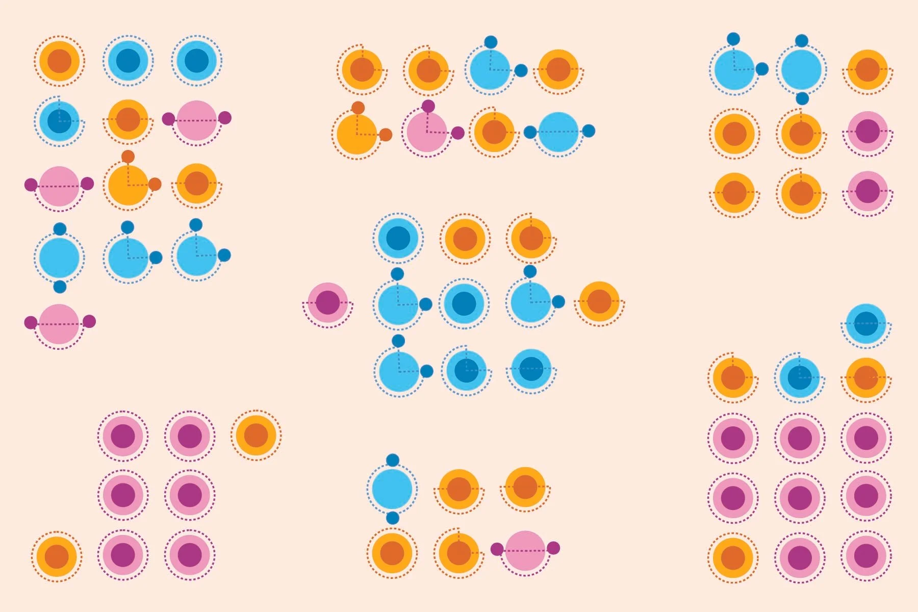
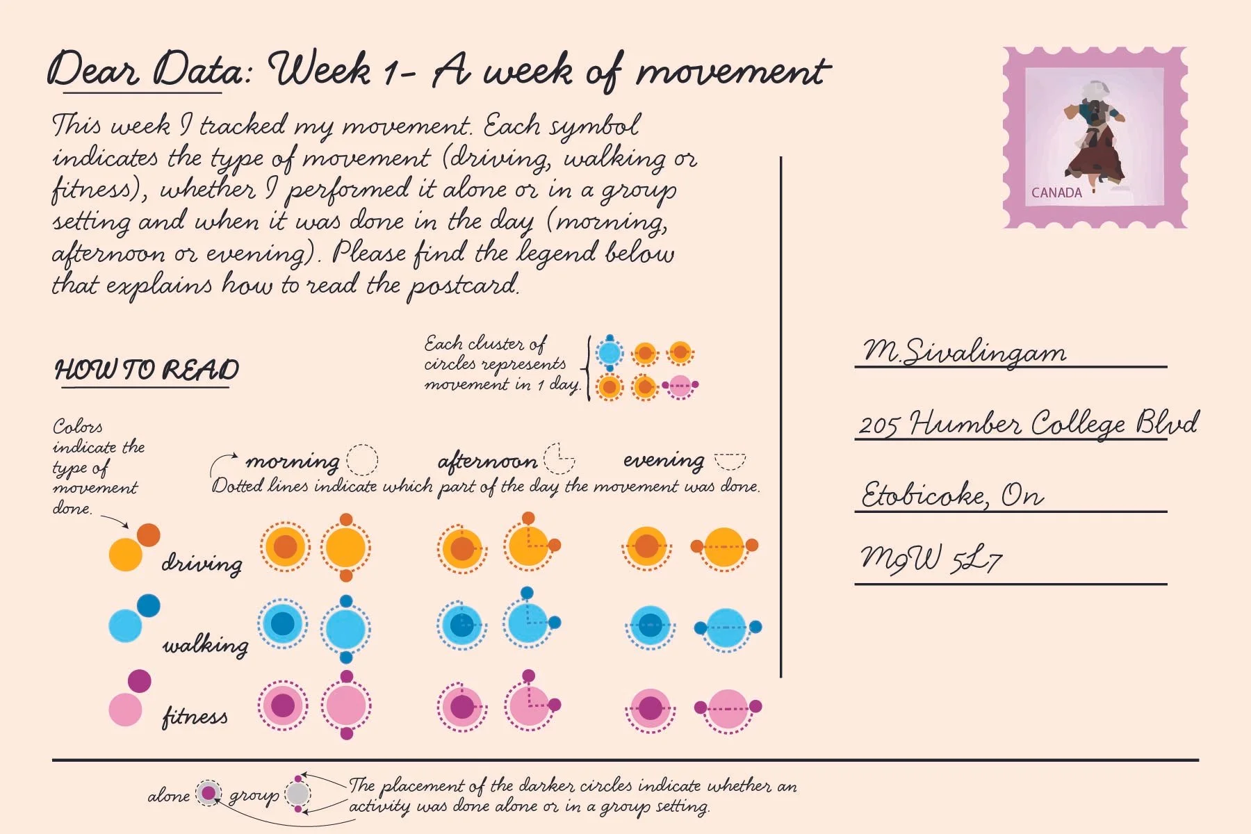
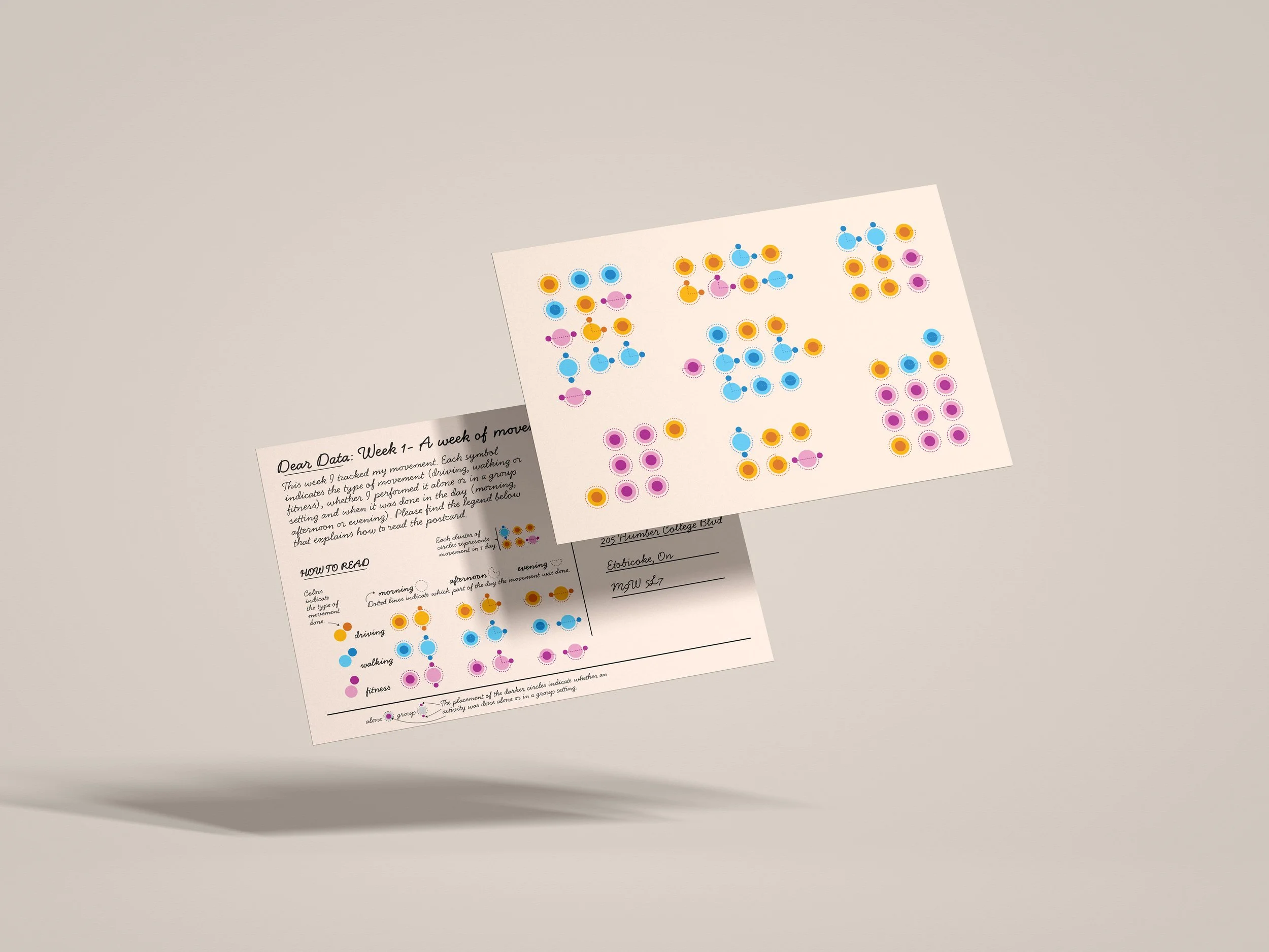
Week 1 postcard front design with abstract art containing yellow, pink and blue circles
Week 1 postcard back design with an explanation of how to read the front of the postcard.
Two postcards hovering with Week 1 front design hovering over the Week 1 backside of postcard on a grey background.

THE CLIENT & PROJECT

Dear Data is a series of postcards created by Giorgia Lupi and Stefanie Posavec tracking daily habits. The following project entails my own reinterpretation using four postcards tracking four habits that I encountered throughout different weeks. These were then interpreted visually in an abstract way on one side with explanations of how to read the visuals on the other.
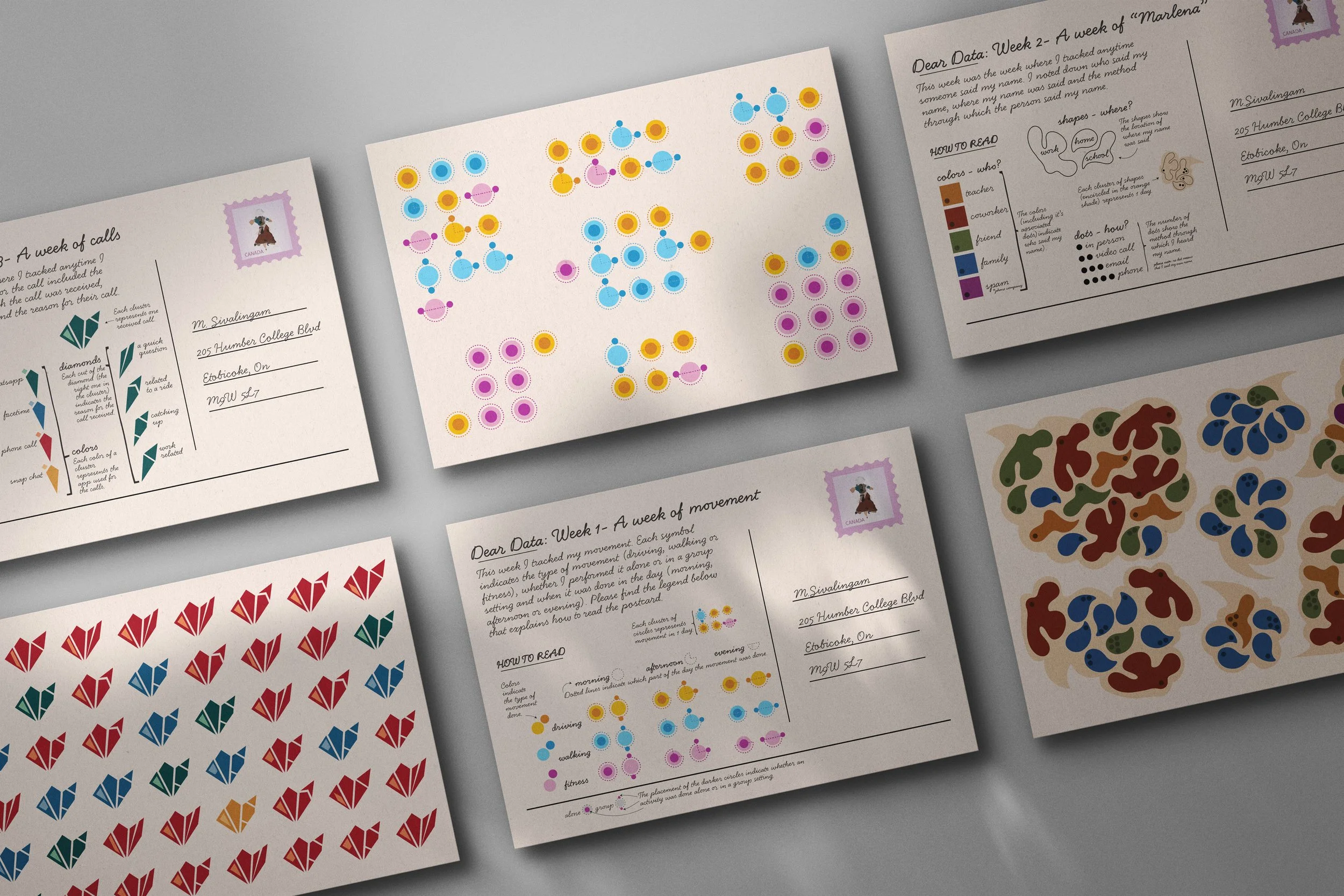

Six postcards laid out on a grey background with only two fully visible.

THE TOOLS

Google Docs

Illustrator


THE PURPOSE

Habit tracking was done in order to get a better understanding of the data that surrounds us everyday. Dear Data helps to highlight patterns that occur within our everyday lives that we may not have realized.


THE STRATEGY

Google Docs tracking movement from Monday Feb 02 to Sunday Feb 08.

In order to brainstorm the habits to track, I studied the topics of the existing postcards series by Giorgia Lupi and Stefanie Posavec. Google Docs was used to organize and easily interpret the data.

Google Docs closeup showing the variables at the bottom of the tracked habit highlighted in blue.

Deciding on the three factors to focus on for the postcards associated with this habit.

Tracking the habit of movement on Google Docs from Feb 02 - Feb 08.
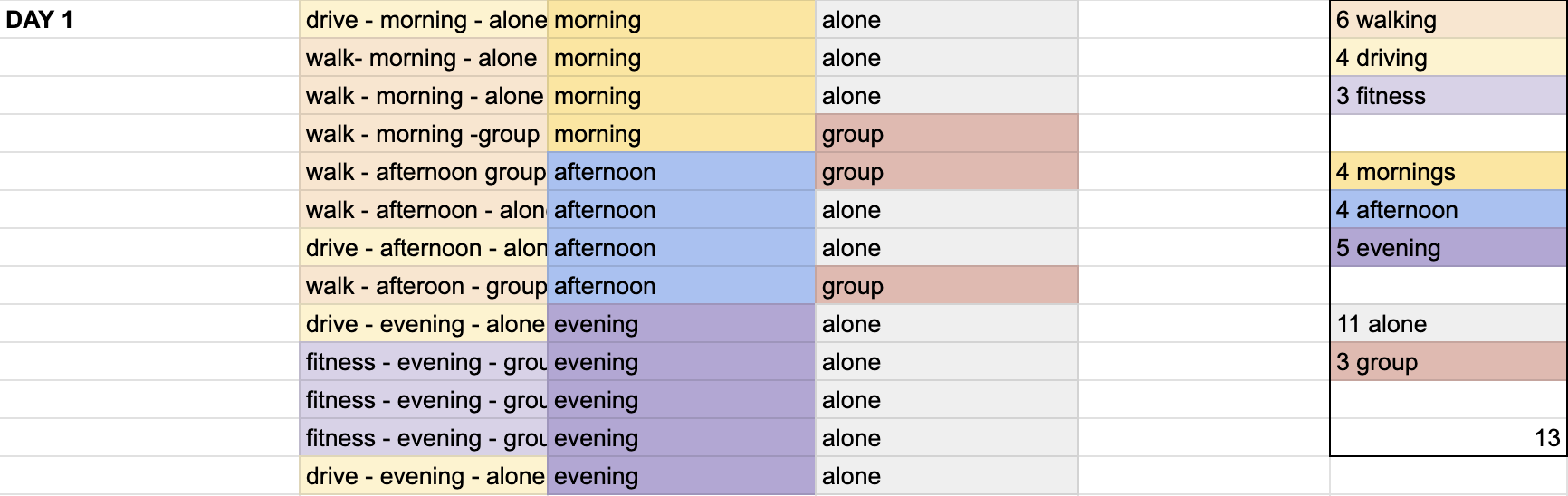
A colour coded google docs organizing the movement habit.

Color coding the data to help determine how to visually translate this information.
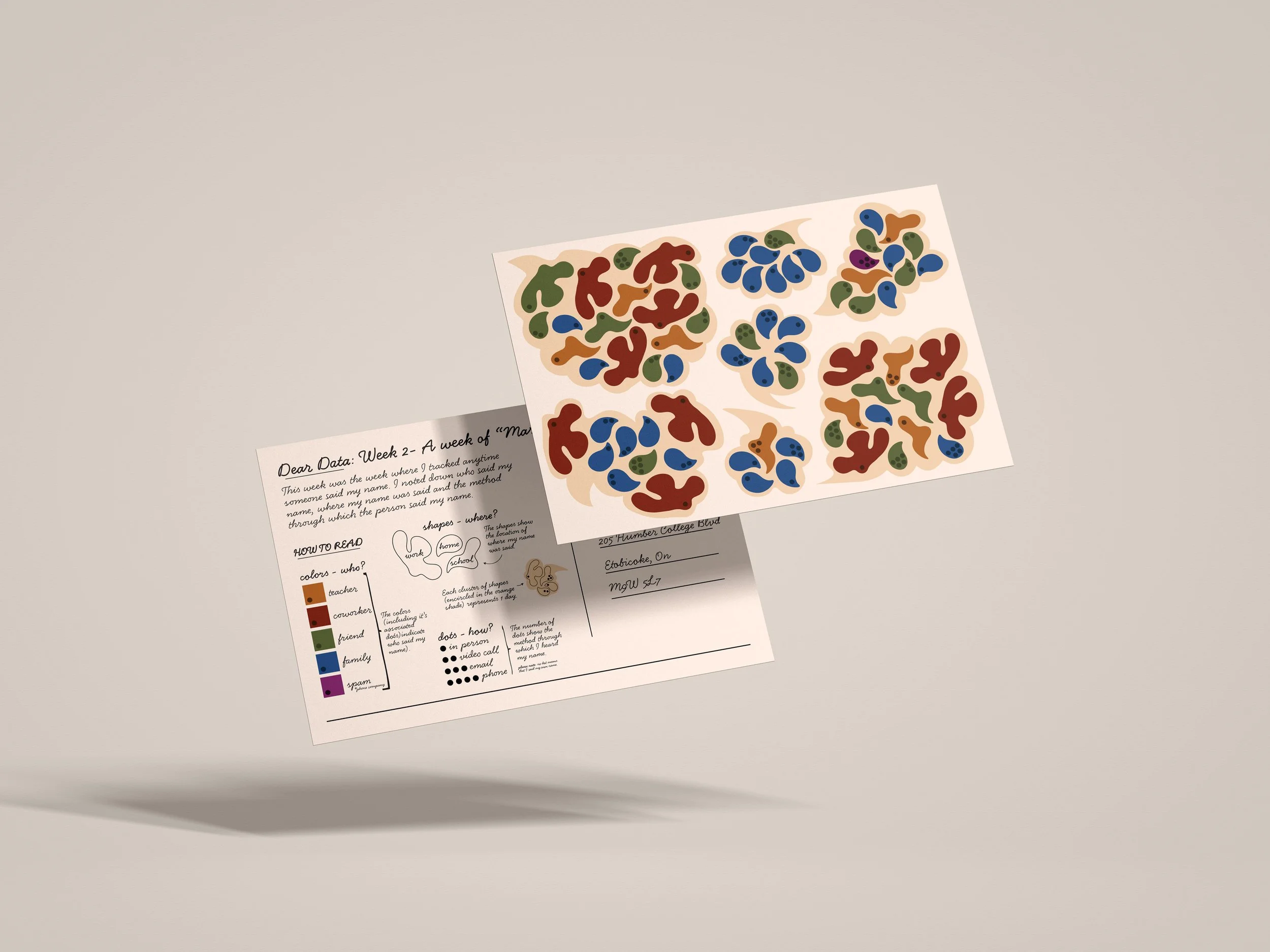

Two postcards hovering with Week 2 front design hovering over the Week 1 backside of postcard on a grey background.
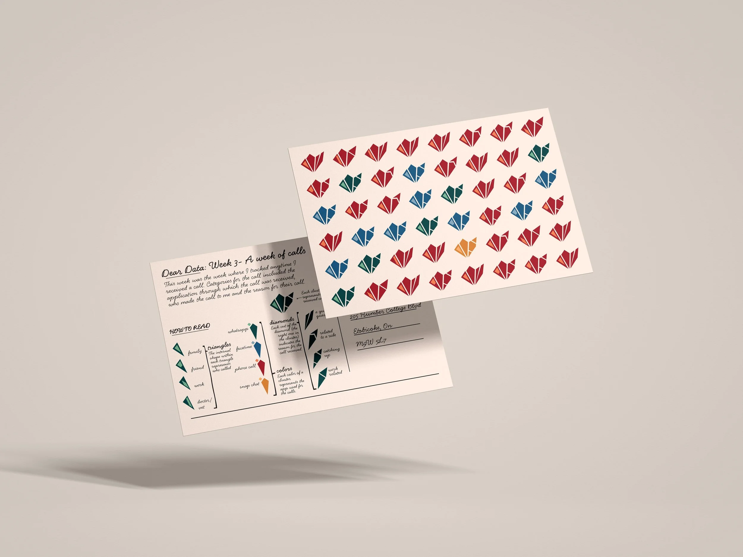
Two postcards hovering with Week 3 front design hovering over the Week 1 backside of postcard on a grey background.
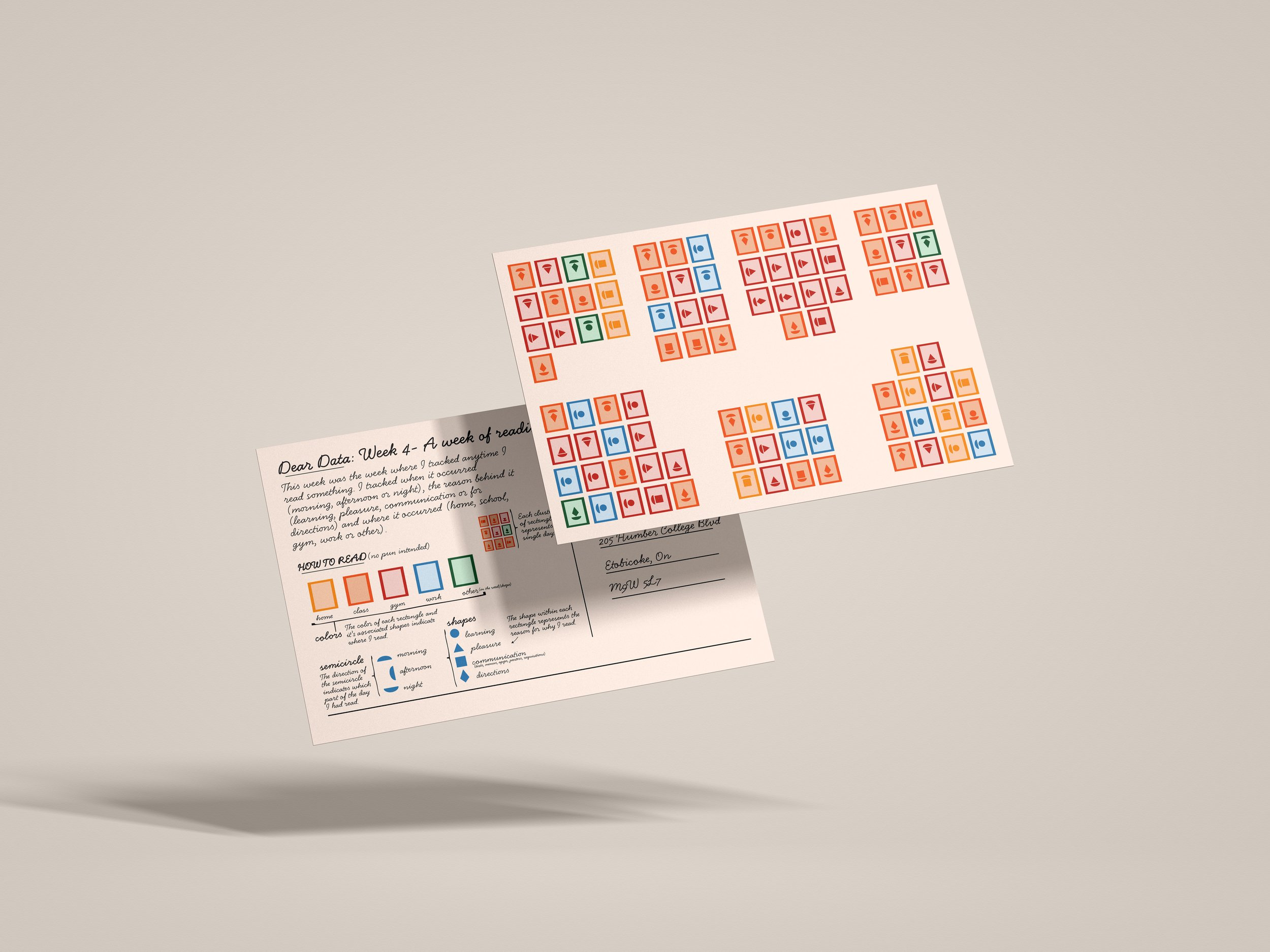
Two postcards hovering with Week 1 front design hovering over the Week 4 backside of postcard on a grey background.

THE PROCESS

Starting with brainstorming on the four habits to track, I was able to narrow down my topics to the following:

  1. A Week of Movement

  2. A Week of “Marlena”

  3. A Week of Calls

  4. A Week of Reading

Afterwards, a Google Docs was created to track the data for each habit. This document was colour coded and organized accordingly.
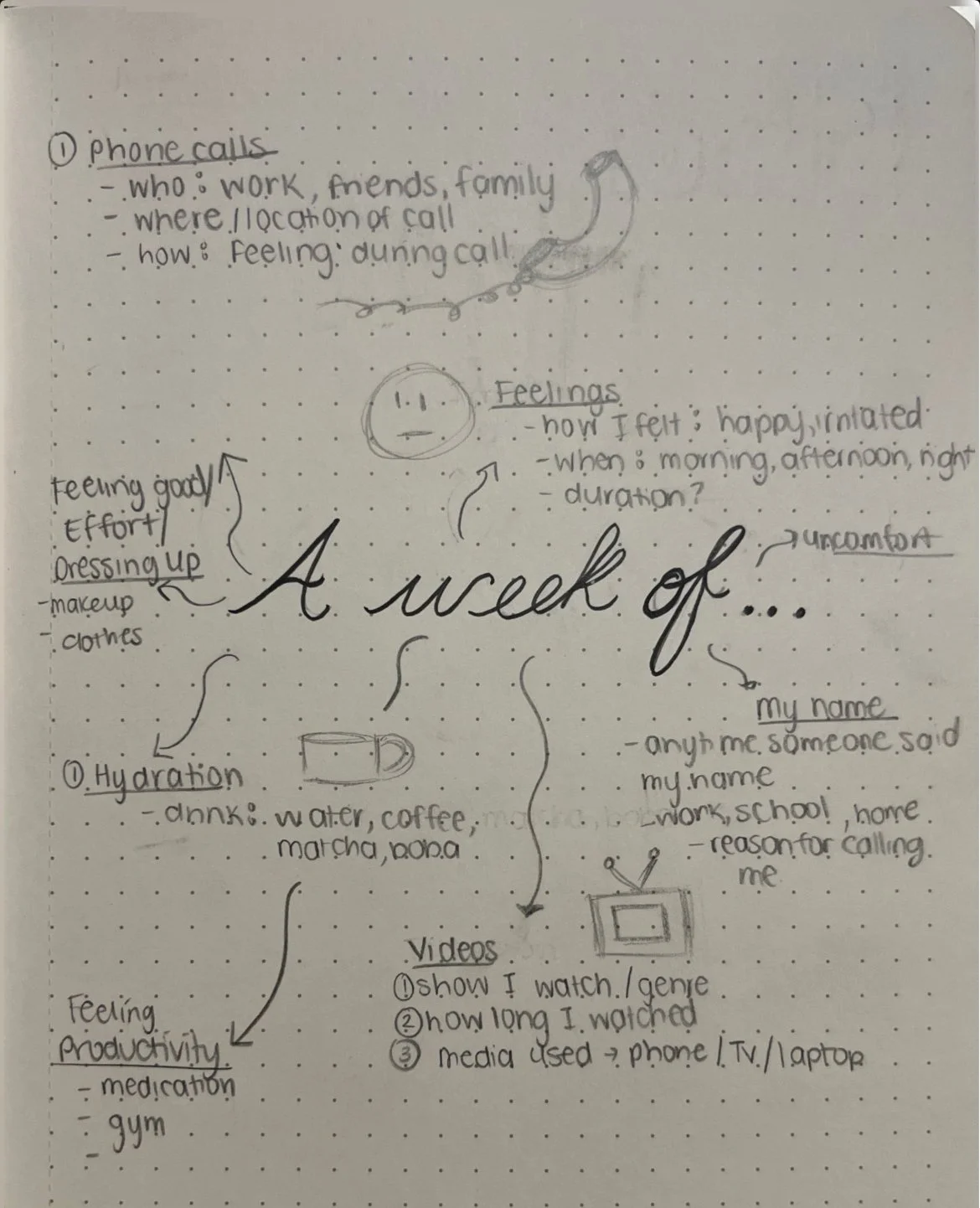
A dotted page showcasing the brainstorm process of the possible habits to track.

Once the data was collected, three variables were determined for each habit to be visually translated into abstract art.

Rough sketches were drawn out and then brought into Adobe Illustrator to create vector images in an abstract visual.
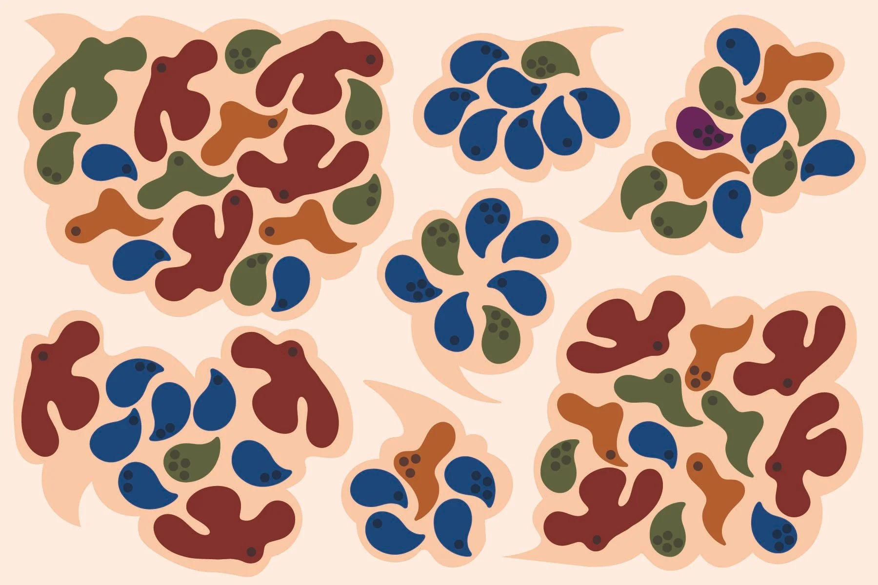
Week 2 postcard front design with abstract art containing round shapes of red, green, yellow and blue.
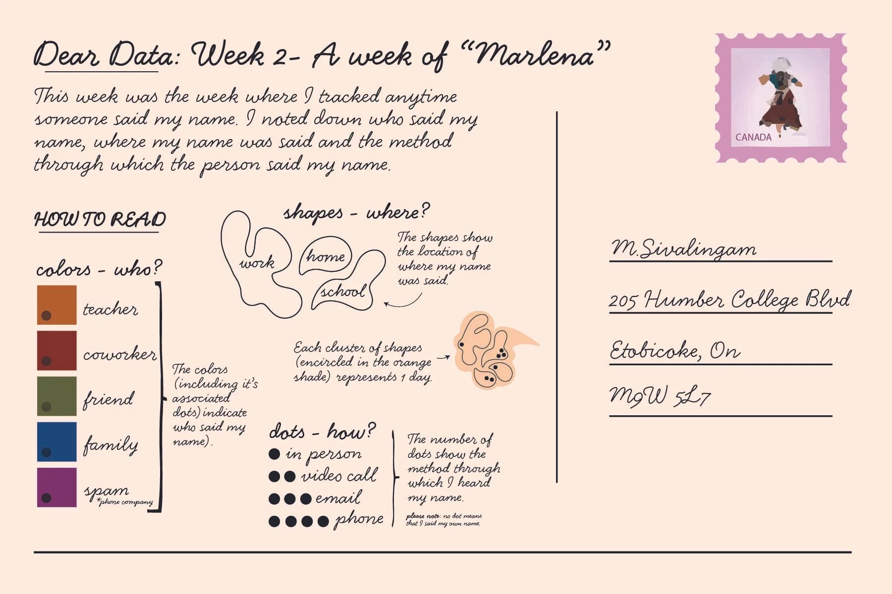
Week 2 postcard back design with an explanation of how to read the front of the postcard.
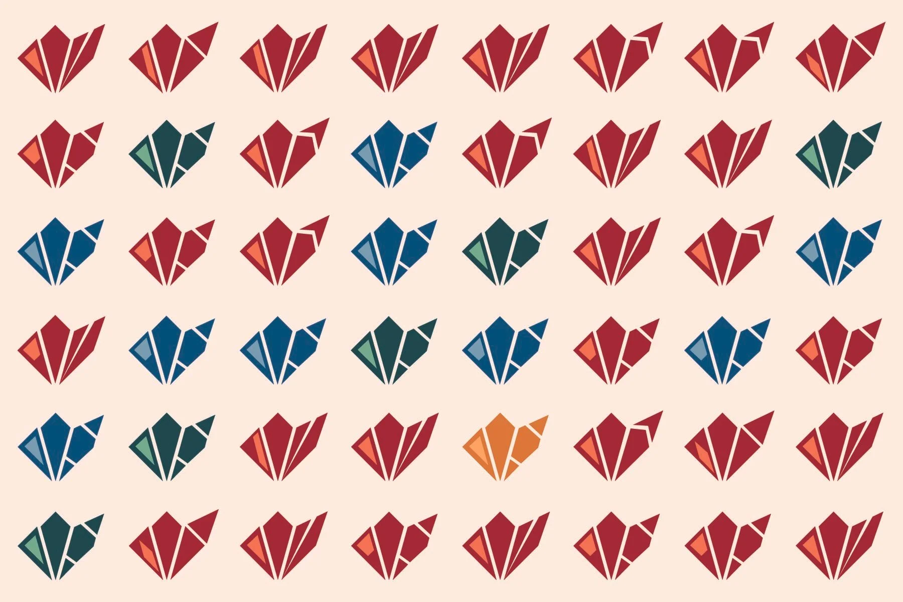
Week 3 postcard front design with abstract art containing diamond clusters of yellow, red, blue and green.

THE LESSON

I was able to realize that habits can be tracked, whether they are activities that we unknowingly partake in or ones that we consciously do and that they can be interpreted visually in an abstract way. I also noticed that there were certain habits that I did more frequently such as calling on a phone which I did not notice until completing this project.
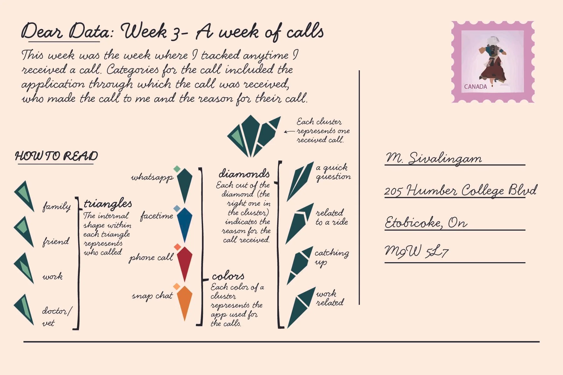
Week 3 postcard back design with an explanation of how to read the front of the postcard.
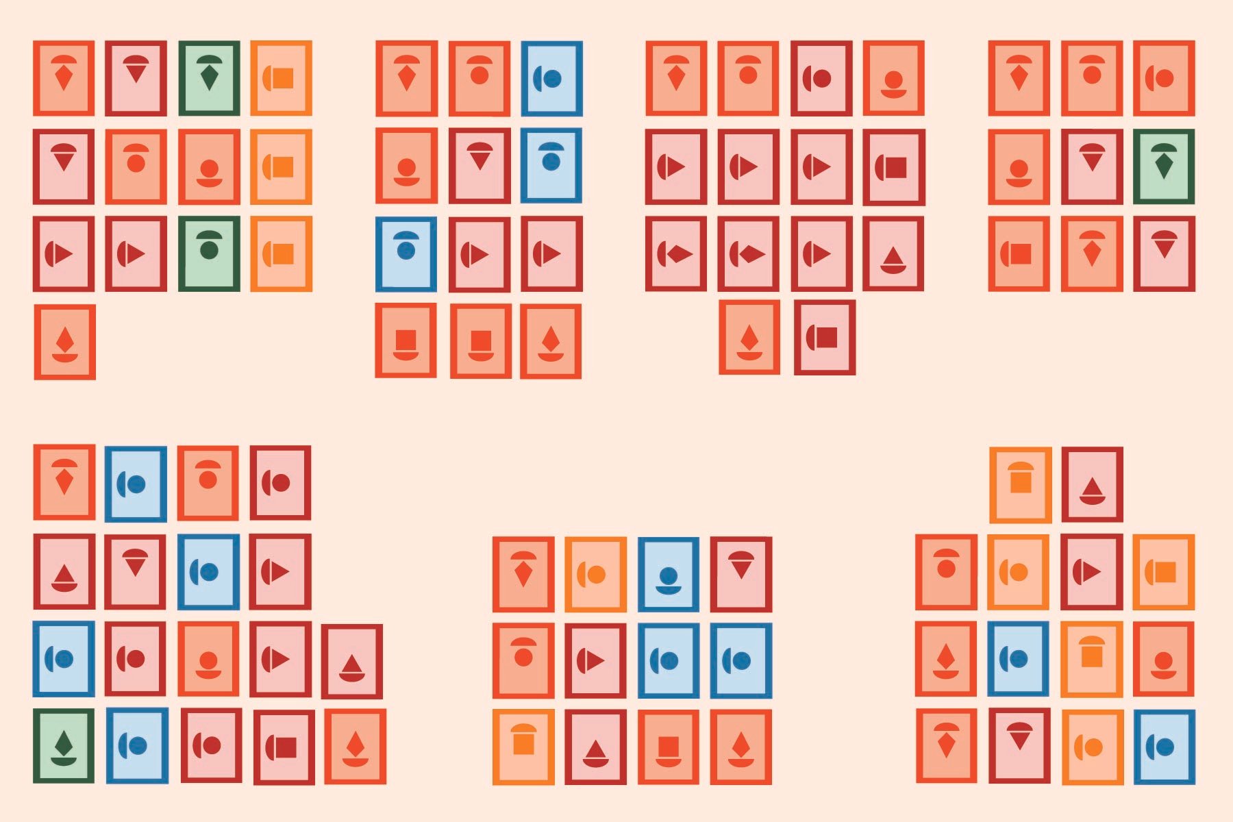
Week 4 postcard front design with abstract art containing shapes within rectangles of orange, green, red and blue.
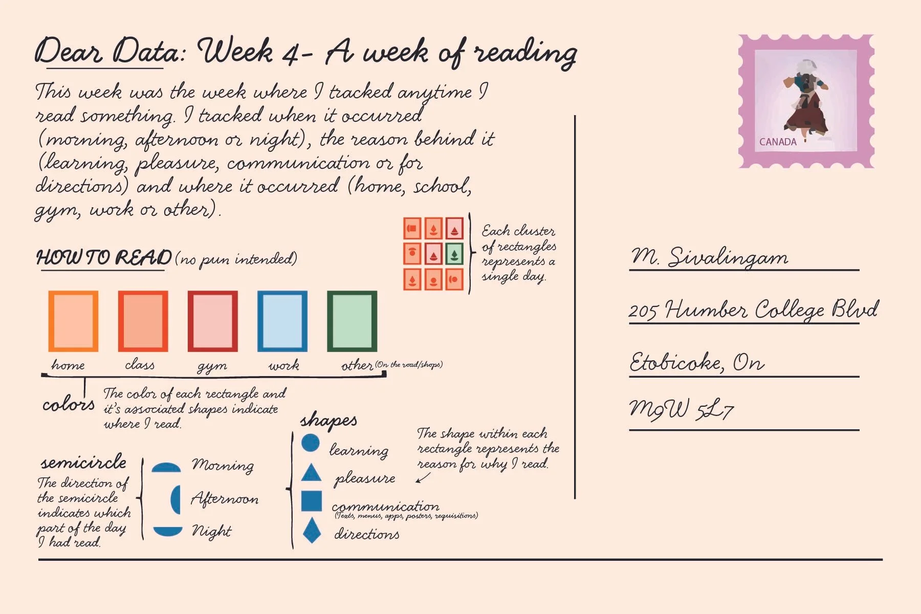
Week 4 postcard back design with an explanation of how to read the front of the postcard.