EDITORIAL DESIGN
KINFOLK
THE CLIENT & PROJECT
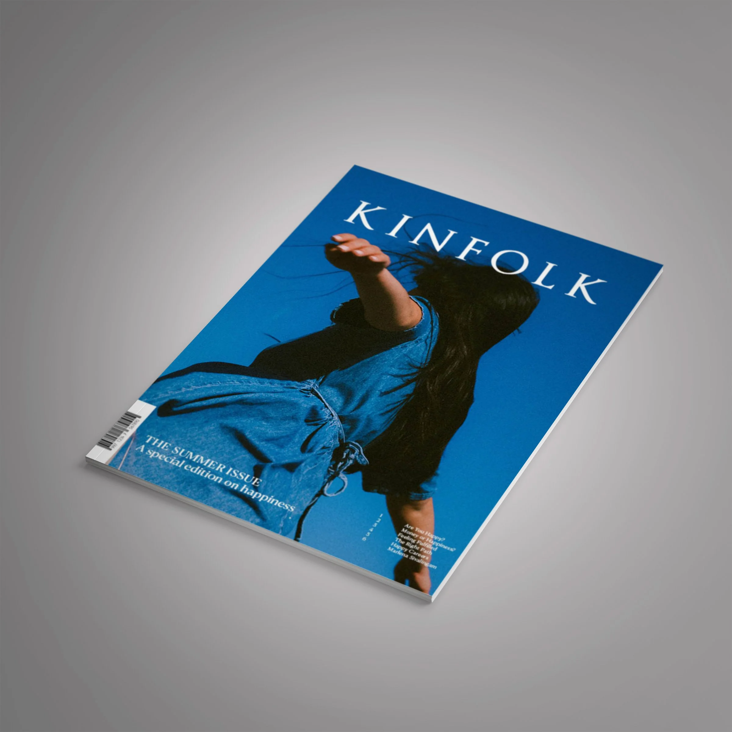
Kinfolk is a lifestyle magazine that explores topics of home, work, fashion and culture. It focuses on promoting a quality of life to it’s audience, who are composed mainly of young to middle aged educated adults. The following project is my reinterpretation of Kinfolk.
THE TOOLS

InDesign
Photoshop
THE PURPOSE
Recreating a special edition for Kinfolk allowed me to study the editorial style of an existing magazine. By focusing on the formatting and framing of the design elements, it helped to learn the brand’s style.
THE STRATEGY
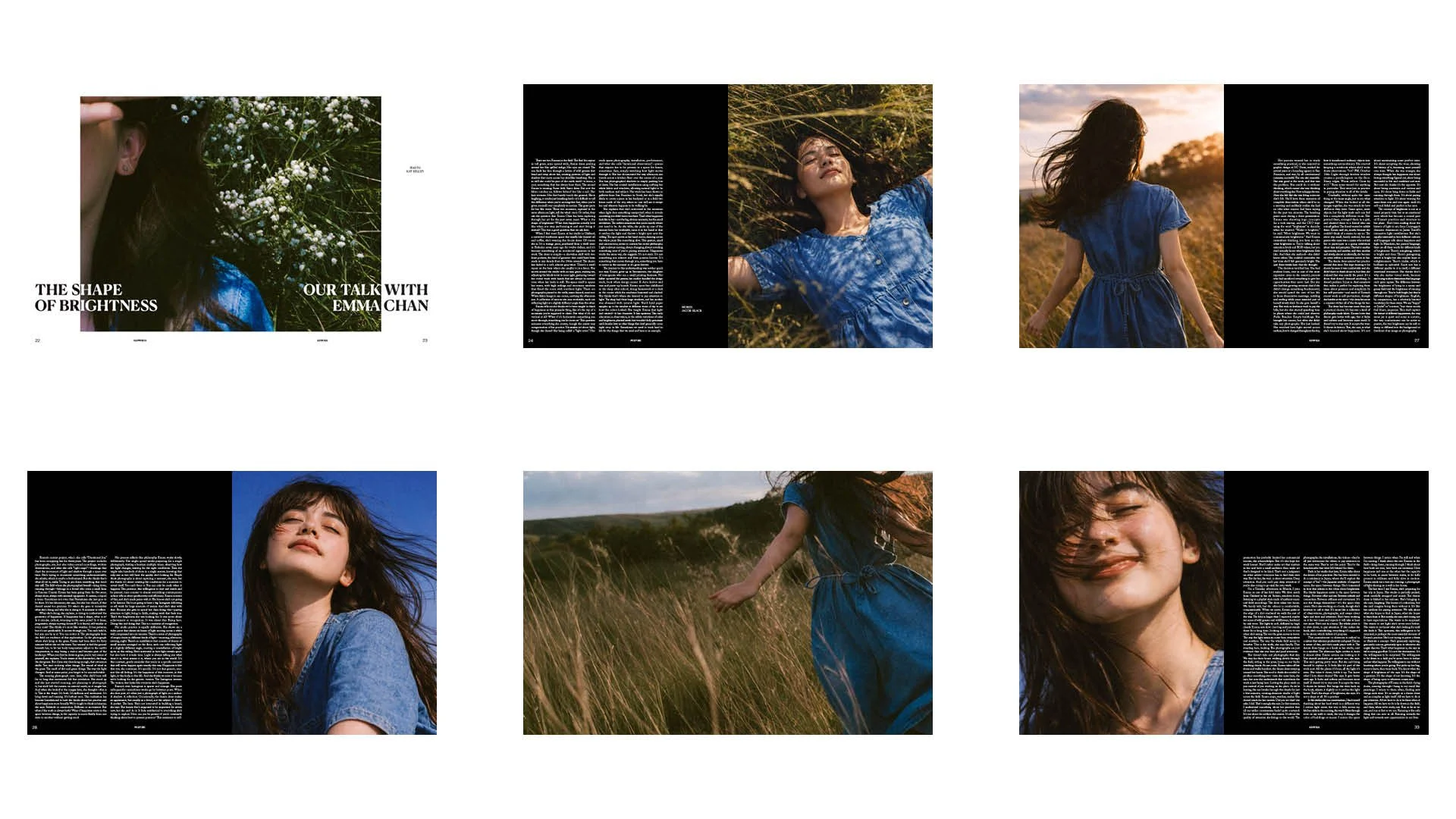
Through the research of the magazine’s existing page layouts, typography, colour palettes and photography, mood boards were created in order to produce my own special edition on happiness.
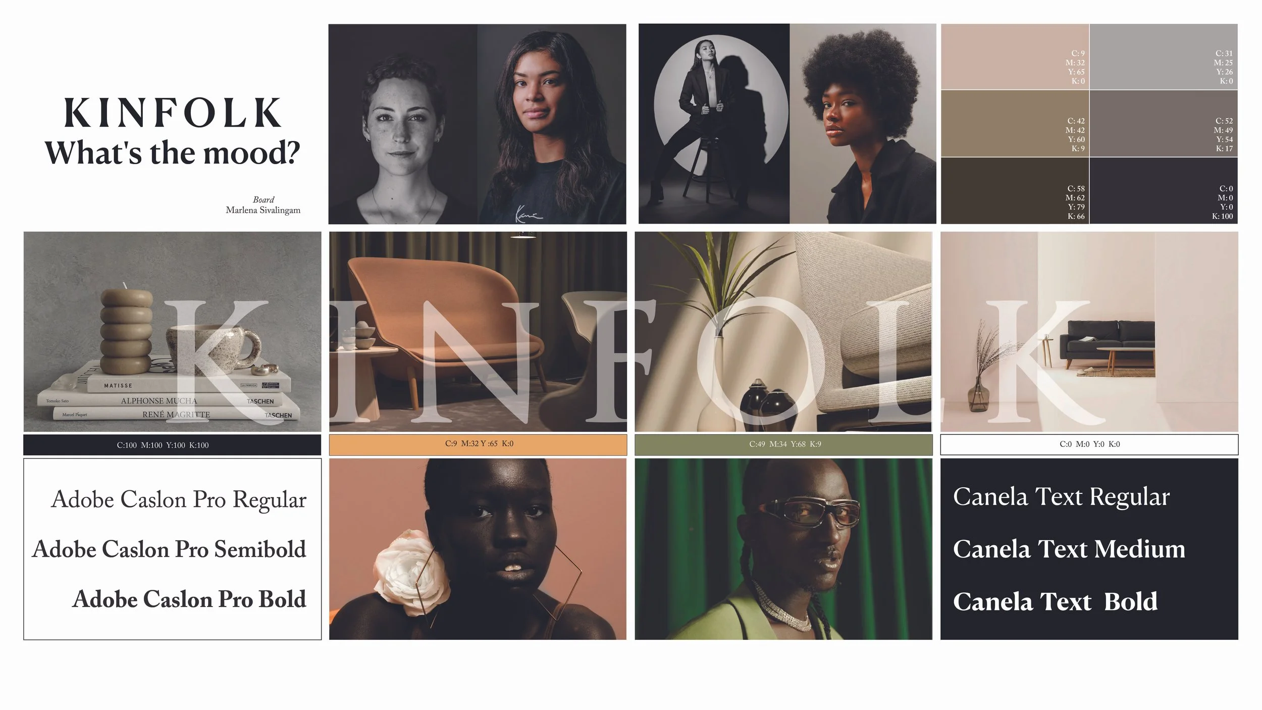
One of the many mood boards created while studying Kinfolk’s editorial design style.
THE PROCESS
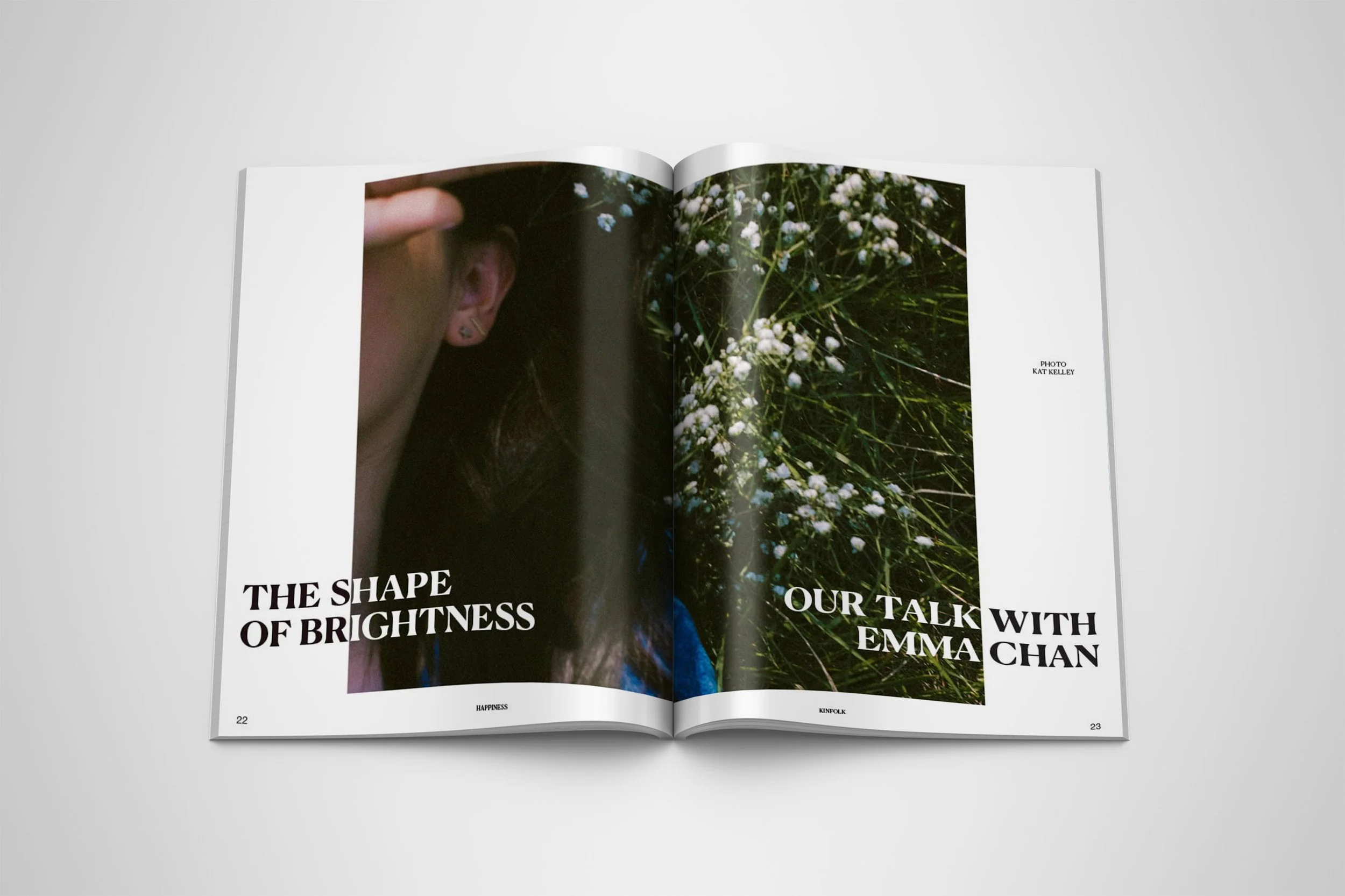
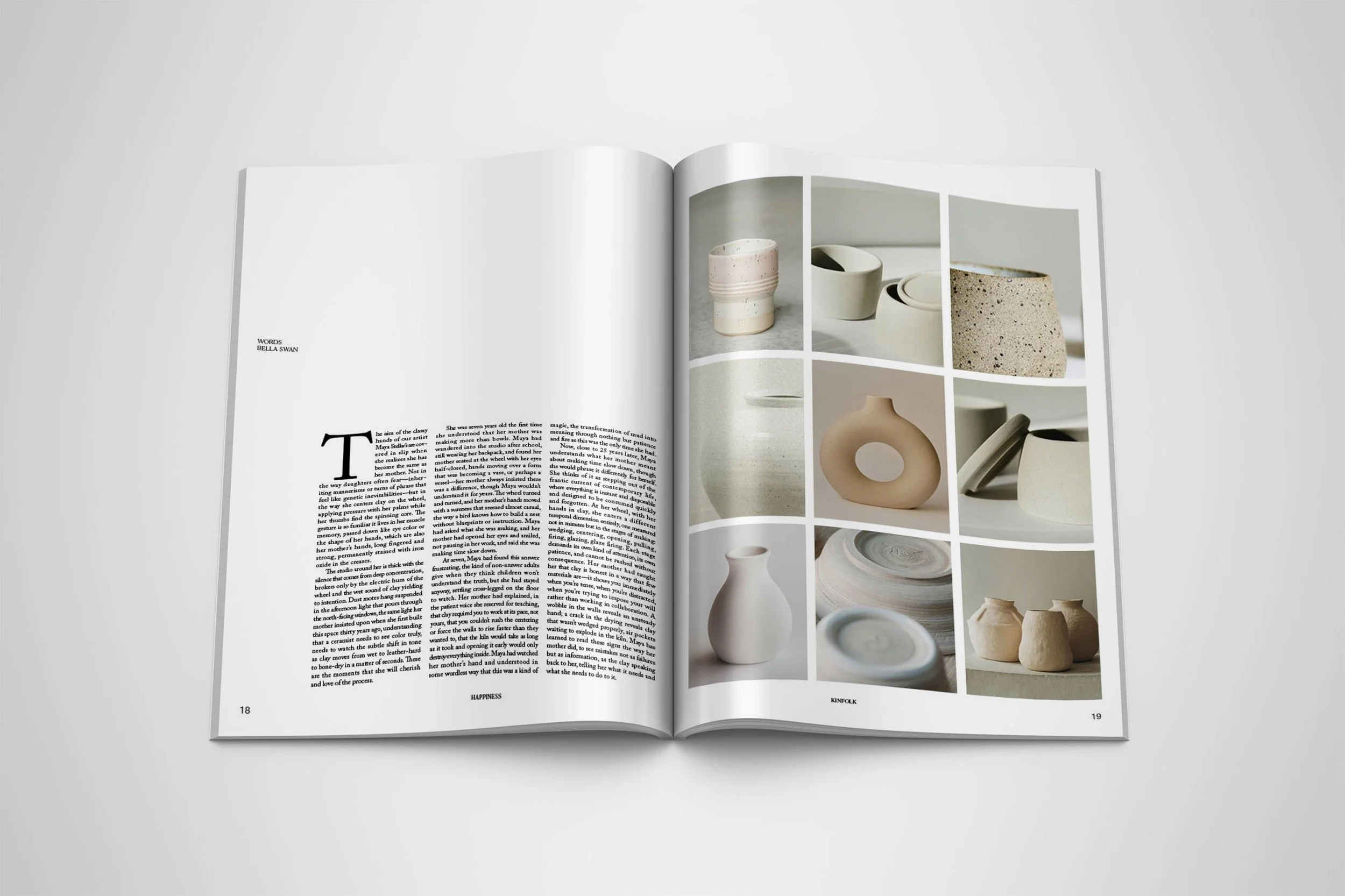
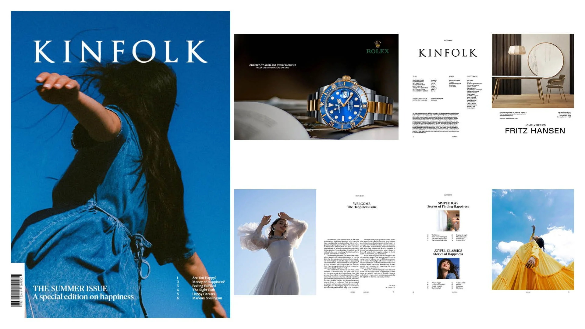
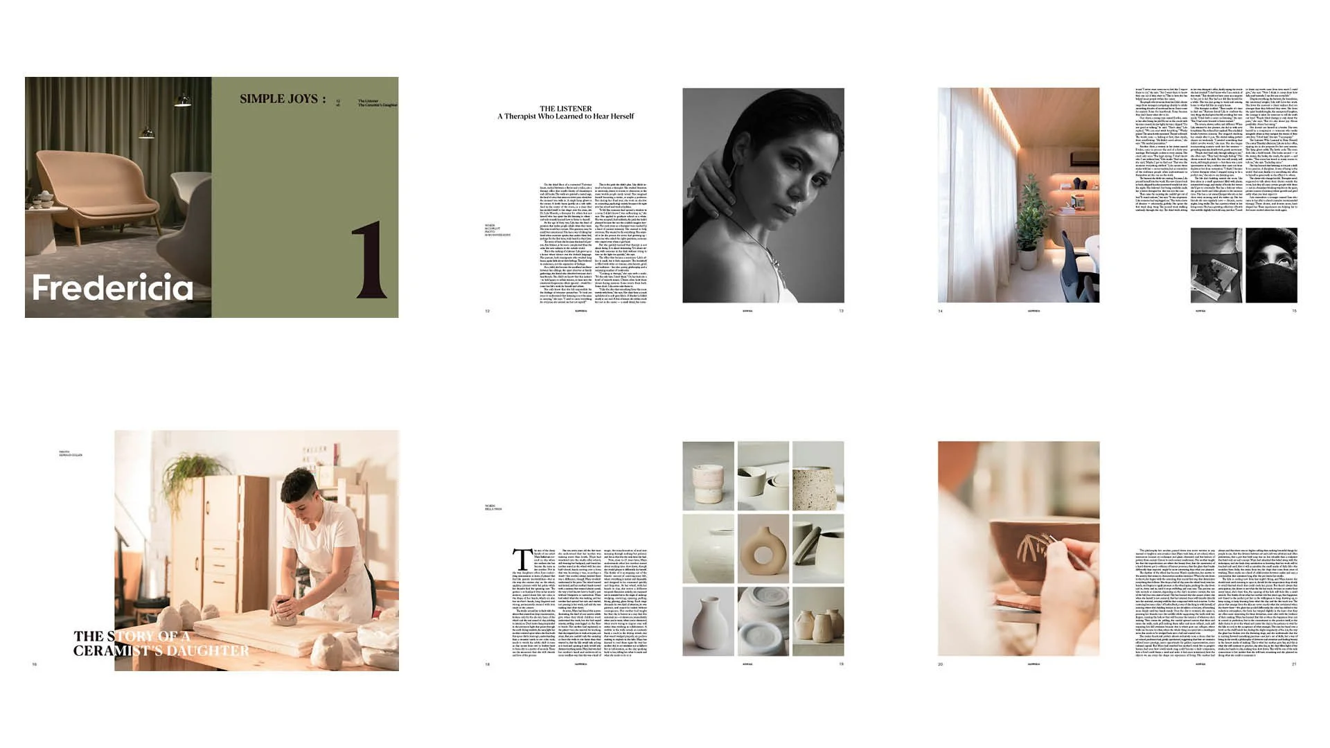
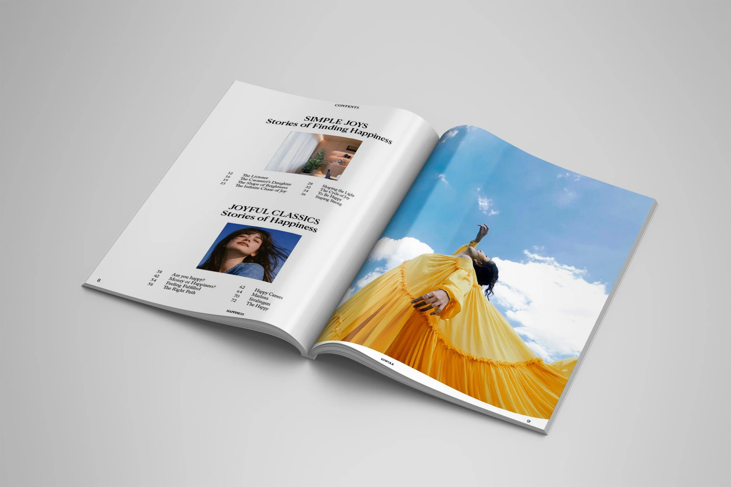
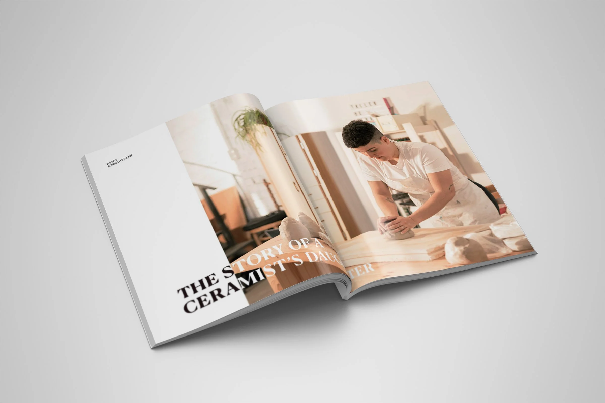
Kinfolk magazine maintains an elegant and sophisticated style. After carefully studying the magazine’s elements, I recreated my own version. My issue maintains the style through the use of justified text and white spaces.
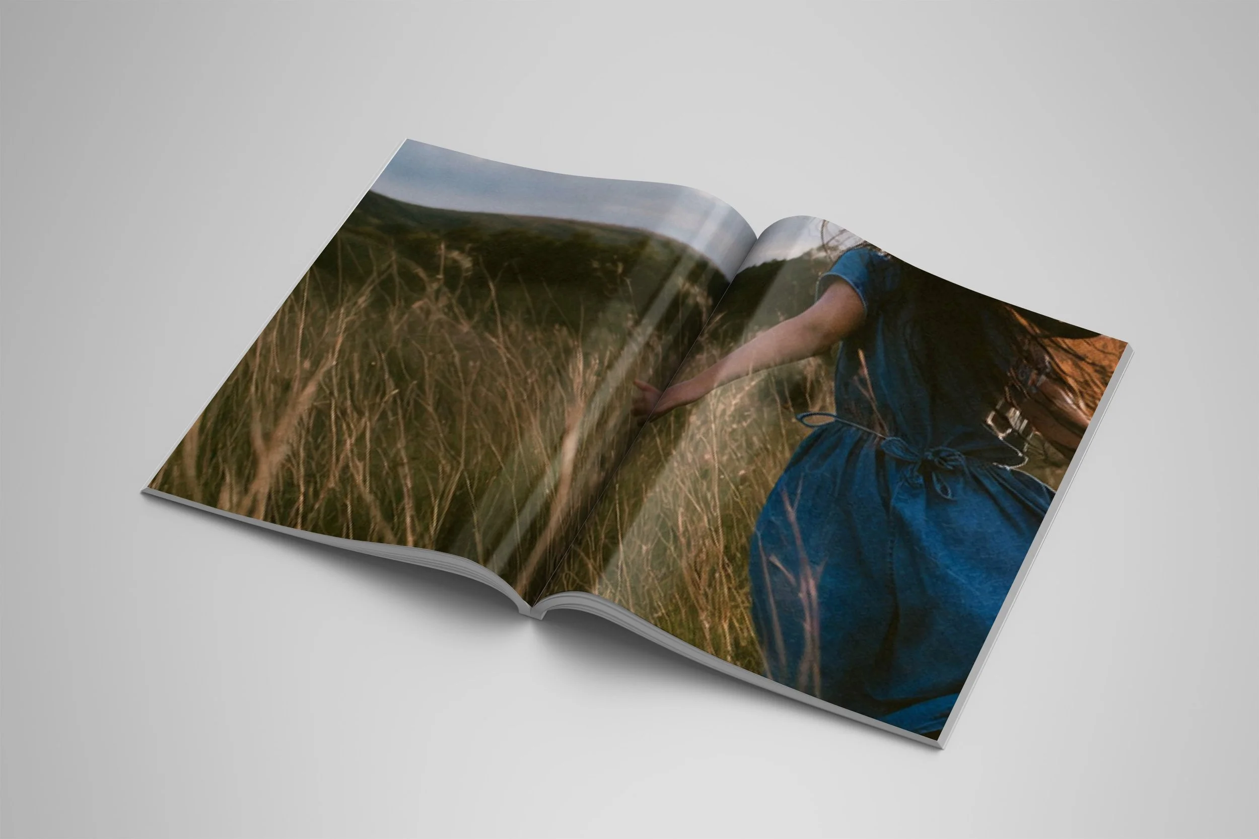
The photography within Kinfolk consists of vibrant yet neutral colours which is what influenced the imagery used within my edition.
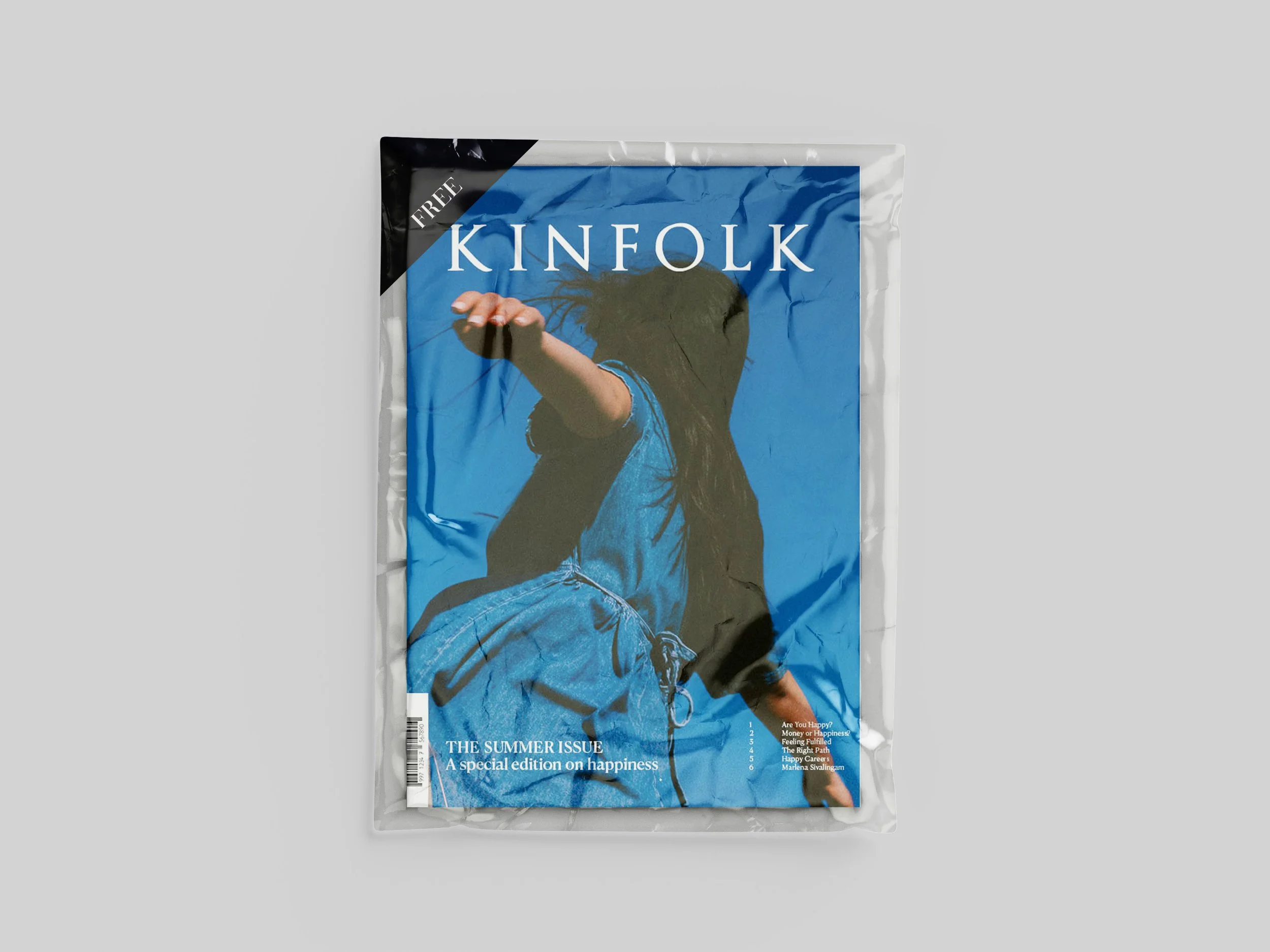
Kinfolk issues use everyday creatives in their natural elements for their stories and photography. The happiness edition showcases this through an artistic perspective within the used imagery.
Through the creation of a flat plan, I was able to effectively design the pages for my own issue of Kinfolk. The final product was a print of the issue for the client.
THE LESSON
Prior to this project, I may not have appreciated the effort put into the maintenance of justified text. Now, I cannot help but notice the typography found within magazine pages and study how the designs on the pages may have been created.